The Enrollment Report

The Enrollment Report can be found in the Reporting section of the Clutch Portal. This report allows you to view and track enrollment metrics in aggregate and by location views.

Be sure you have an Account Group selected or applied to your user in order to view all of the reports. You can click within each section to learn more about each aspect of the report.

For brands who were previously using our Legacy Reports for Enrollment, here’s how our new report has been updated.

Activating (Owning) vs Enrolling Location

The Explore Data Enrollment Report attributed all enrollments to the Activating (Owning) Location. The new Enrollment Report allows you to see and filter your metrics by the Activating and the Enrolling Location.

We made this change because some of our brands have a two-stage enrollment process. In this setup, the customer’s card is activated in-store, but the enrollment process is completed when the customer provides additional information either online or in an app. Adding this additional breakout gives these brands further insight into where customers are completing each step in the enrollment process.

More Precise Enrollment Timestamps

The previous Enrollment report was only able to leverage the Enrollment Date field which only contained the date stored in UTC. This meant that the old report could only be filtered in UTC. As part of the improvements in our rebuild, we are now also leveraging Enrollment Time which captures the exact time the customer enrolled down to the second.

With these changes, the Date Range filtering in this report is now specific to the brand’s Reporting Timezone.

Filters

You’ll be able to target specific data within your report by using the available filters on top. These filters include:

This allows you to control your report view and how the metrics are broken out. Options include Aggregate and By Location. Aggregate is the default.

This allows you to filter based on the transaction date. You can select start and end dates. Note that the default for this is the last 6 months.

All dates are specific to the brand’s reporting time zone that is configured in their brand settings.

  • Start Dates begin as of 12:00:00AM of the chosen date.
  • End Dates end as of 11:59:59PM of the chosen date.

This allows you to change whether you’re viewing enrollment based on the activating location or enrolling location. The Location Type filter only appears in the By Location View.

This button opens a drawer to give the user a list of additional optional filters to apply to the report, including Activating Location, Enrolling Location, and Segment.

Note that if your user has a Group and/or Location applied in the Account menu, the data may be filtered to that specific Group and/or Location. If these filters have been applied to the report you are viewing, you will see them in the More Filters section.

Once you have the filters you want in place, click the Update button to update your report.

Aggregate View

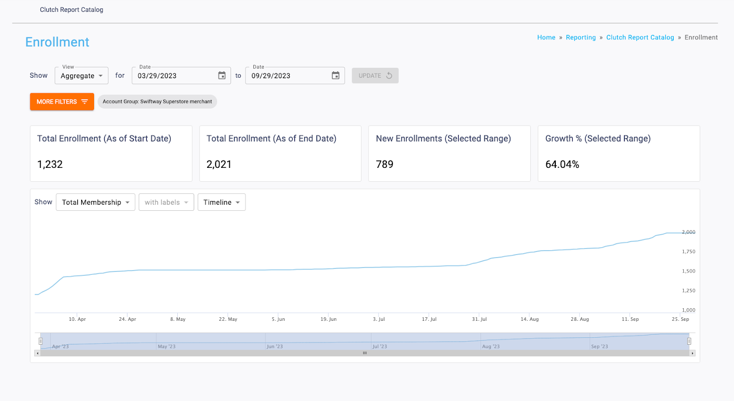
You’ll be able to see a variety of data within the reporting table when in Aggregate view, including a variety of infoboxes and a trend over time chart. Read below to learn how to utilize these.

Infoboxes
The following infoboxes can be seen while in aggregate view.

This is the count of cards enrolled in loyalty as of the chosen start date.

This is the count of cards enrolled in loyalty as of the chosen end date.

This is the count of newly enrolled cards between the start and end date.

This shows the New Enrollments (Selected Range) divided by Total Enrollment (As of Start Date).

Trend Over Time Chart
The graph shows various sales metrics over time. You’ll be able to alter the time period as well as show the information with or without labels. 

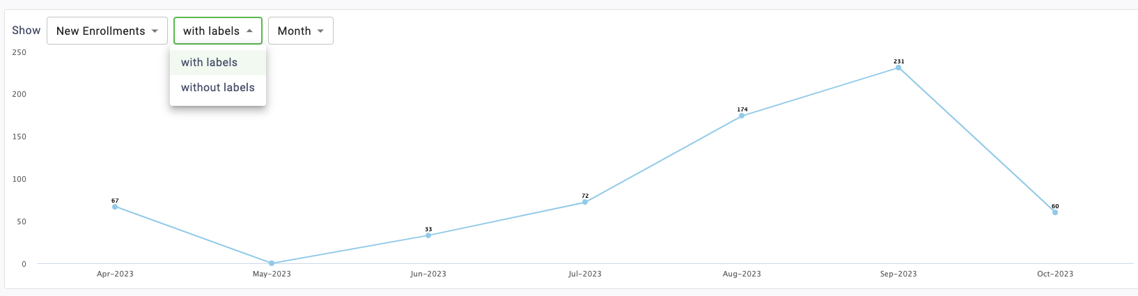
The Labels dropdown is used to toggle whether data labels will appear on the graph or not. Selecting with labels will display a more detailed graph containing labels. Selecting without labels will display a cleaner graph.

Note that this feature is disabled for the Timeline version of this graph.

You’ll be able to determine the timespan of the chart. It can toggle between Timeline, Month, Quarter, or Year. Read below to learn more about these timespan options.

Timeline
This displays a trend over time chart that plots metrics by day. The bar on the bottom of the chart can be used to zoom in or out to different date ranges on the timeline. All data for the selected date range will be displayed. If more than a year is chosen in the Date Range picker, the Timeline option will be disabled and the graph will default to the Month view.

Month
This displays a trend over time chart that summarizes metrics by month.

Quarter
This displays a trend over time chart that summarizes metrics by quarter.

Year
This displays a trend over time chart that summarizes metrics by year.

Location View

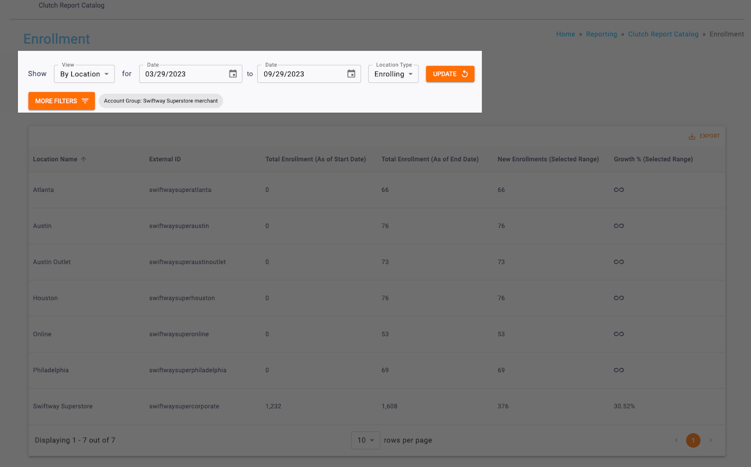
You’ll be able to see a variety of data within the reporting table when viewing By Location view. You will see the report table with the following columns:

  • Location Name
  • External ID
  • Total Enrollment (As of Start Date)
  • Total Enrollment (As of End Date)
  • New Enrollments (Selected Range)
  • Growth % (Selected Range)

Note: The table results can be downloaded as a CSV using the Export button. Table columns can be temporarily rearranged by holding a click on the column header and dragging to the left or right. These changes are passed through to the Export and reset when the page is reloaded.

Print Friendly, PDF & Email
Updated on April 12, 2024

Was this article helpful?

Related Articles