The Life Cycle report can be found in the Reporting section of the Clutch Portal within the Clutch Report Catalog. It allows you to view metrics based on a customer’s life cycle status. Learn how to utilize this report within this article.
Filters
You’ll be able to target specific data within your report by using the available filters on top. These filters include:
This allows you to filters based on the life cycle date. You can select start and end dates. Note that the default for this is the last 6 months.
All dates are specific to the brand’s reporting time zone that is configured in their brand settings.
- Start Dates begin as of 12:00:00AM of the chosen date.
- End Dates end as of 11:59:59PM of the chosen date.
This allows you to select a currency to view metrics in if your brand utilizes multiple currencies.
Once you have the filters you want in place, click the Update button to update your report.
Info Boxes
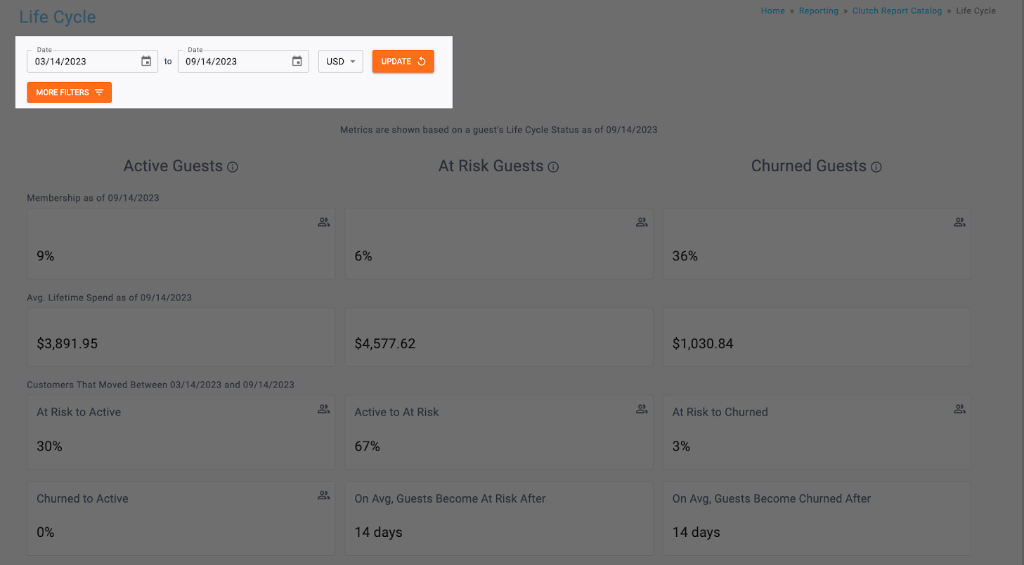
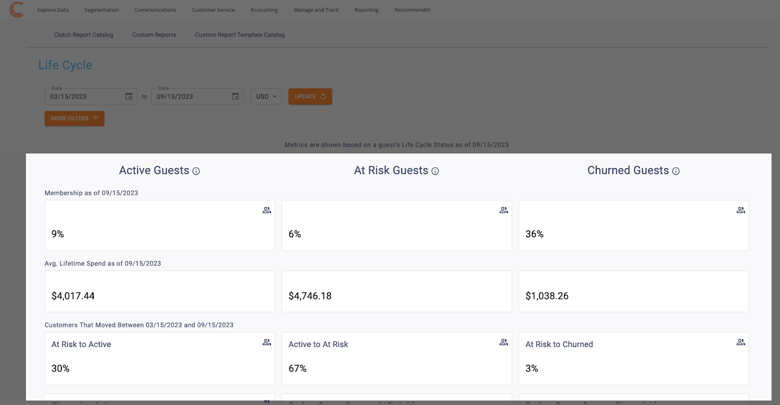
You’ll be able to view a variety of different metrics within the Life Cycle report for Active Customers, At Risk Customers, and Churned Customers.
You’ll be able to view the following metrics for Active Customers
- Percentage of Customers who are Active Customers
- Note: The percentage for Active, At Risk, and Churned customers won’t necessarily add to 100 because the denominator includes customers with no purchases and therefore, no Life Cycle state.
- Average Lifetime Spend of Active Customers
- Customers that moved from At Risk to Active (within the timeframe selected)
- Customers who moved from Churned to Active (within the timeframe selected)
You’ll be able to view the following metrics for At Risk Customers
- Percentage of Customers who are At Risk Customers
- Note: The percentage for Active, At Risk, and Churned customers won’t necessarily add to 100 because the denominator includes customers with no purchases and therefore, no Life Cycle state.
- Average Lifetime Spend of At Risk Customers
- Customers that moved from At Risk to Churned (within the timeframe selected)
- Average Timeframe where customers become At Risk for your brand
You’ll be able to view the following metrics for Active Customers:
- Percentage of Customers who are Churned Customers
- Note: The percentage for Active, At Risk, and Churned customers won’t necessarily add to 100 because the denominator includes customers with no purchases and therefore, no Life Cycle state.
- Average Lifetime Spend of Chunred Customers
- Customers that moved from At Risk to Active (within the timeframe selected)
- Customers who moved from Churned to Active (within the timeframe selected)
Line Graph: Guest Movement Chart
The line graph shows how customers have moved between the life cycle segments over time. You can click on the legend keys to hide and display each life cycle segment as needed.
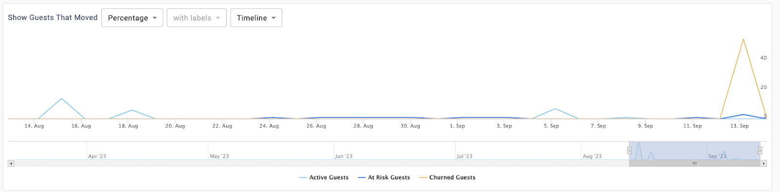
You can view this chart to show the percentage of customers that moved between segments or the count of customers that moved between segments.
The Labels dropdown is used to toggle whether data labels will appear on the graph or not. Selecting with labels will display a more detailed graph containing labels. Selecting without labels will display a cleaner graph.Note that this feature is disabled for the Timeline version of this graph.
You’ll be able to determine the timespan of the chart. It can toggle between Timeline or Month.
In Timeline view, the bar on the bottom of the chart can be used to zoom in or out to different date ranges on the timeline. All data for the selected date range will be displayed. If more than a year is chosen in the Date Range picker, the Timeline option will be disabled and the graph will default to the Month view.
Bar Graph: Various Order Metrics
The bar graph can show the following metrics depending on what is selected from the dropdown. You can click on the legend keys to hide and display each life cycle segment as needed.
The metrics that can be viewed are:
- Average Lifetime Spend
- Average Days Between Transactions
- Average Transaction Count
- Average Order Value
- Basket Size (Average Items per Transaction)
Note that this chart defaults to show Average Transaction Count.
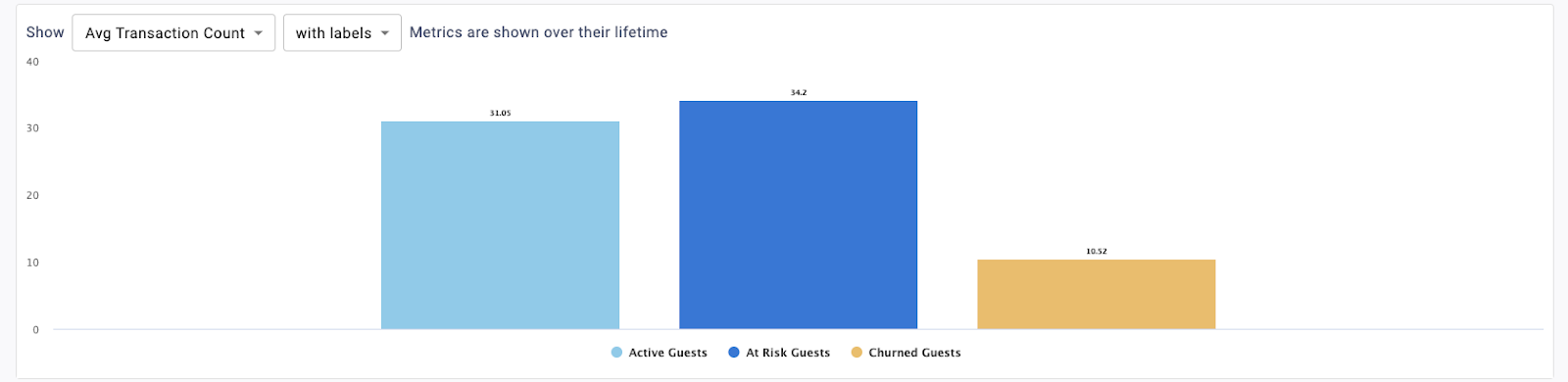
The Labels dropdown is used to toggle whether data labels will appear on the graph or not. Selecting with labels will display a more detailed graph containing labels. Selecting without labels will display a cleaner graph.
This displays a trend over time chart that plots metrics by day. The bar on the bottom of the chart can be used to zoom in or out to different date ranges on the timeline. All data for the selected date range will be displayed. If more than a year is chosen in the Date Range picker, the Timeline option will be disabled and the graph will default to the Month view.
