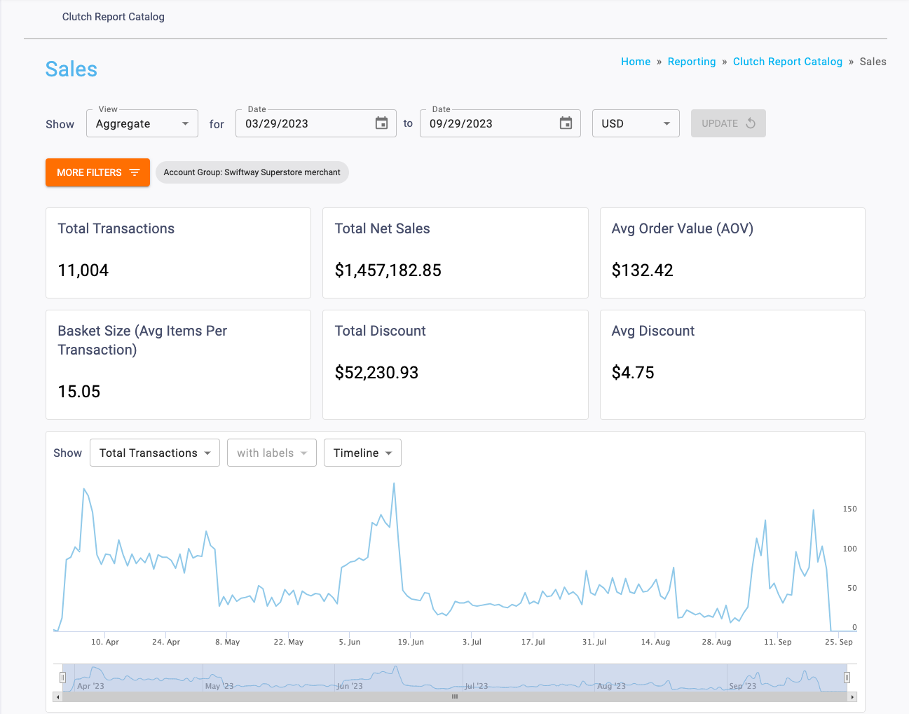
Once you have the filters you want in place, click the Update button to update your report.

Trend Over Time Chart
The graph shows various sales metrics over time. You’ll be able to alter the time period as well as show the information with or without labels.
The metrics that can be viewed are:
- Total Transactions
- Total Net Sales
- Avg Order Value (AOV)
- Basket Size (Avg Items per Transaction)
- Total Discount
- Avg Discount
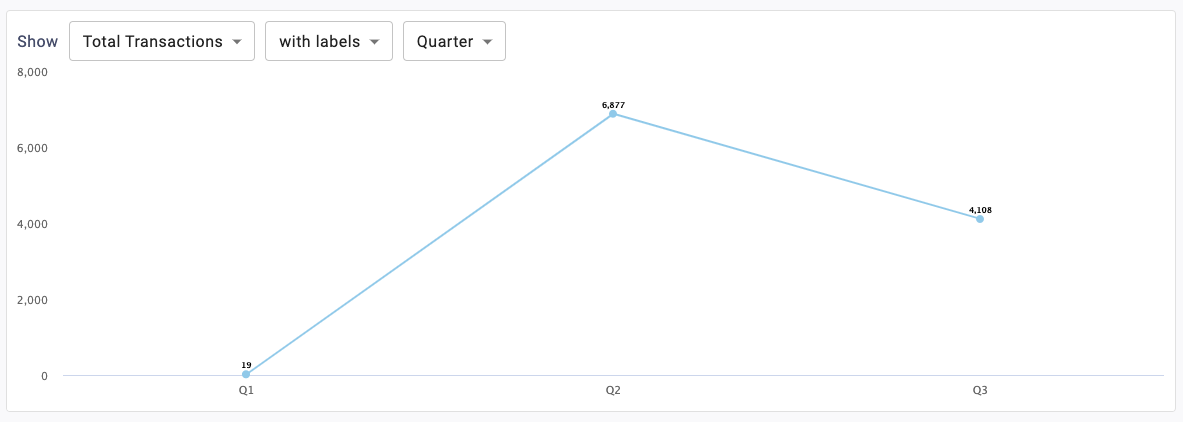
The Labels dropdown is used to toggle whether data labels will appear on the graph or not. Selecting with labels will display a more detailed graph containing labels. Selecting without labels will display a cleaner graph.
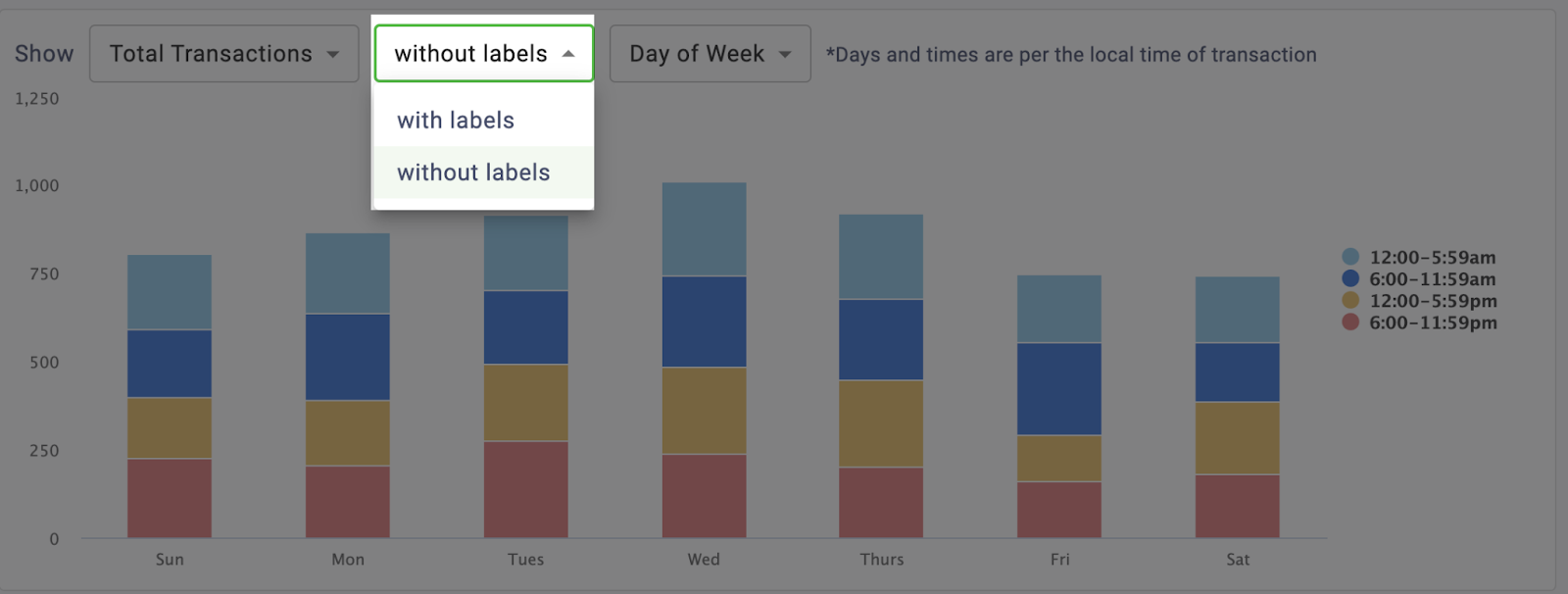
Note that this feature is disabled for the Timeline version of this graph.
You’ll be able to determine the timespan of the chart. It can toggle between Timeline, Month, Quarter, or Day of Week. Read below to learn more about these timespan options.
Timeline
This displays a trend over time chart that plots metrics by day. The bar on the bottom of the chart can be used to zoom in or out to different date ranges on the timeline. All data for the selected date range will be displayed. If more than a year is chosen in the Date Range picker, the Timeline option will be disabled and the graph will default to the Month view.

Month
This displays a trend over time chart that summarizes metrics by month. If more than one year is selected, each year will be broken out into a different series, so you can compare them.

Quarter
This displays a trend over time chart that summarizes metrics by quarter. If more than one year is selected, each year will be broken out into a different series, so you can compare them.
Day of Week
This displays a stacked column chart that breaks metrics out by the day of the week and time of day.

Note that metrics are assigned to the time of day groupings according to the local time of the transaction. For example, if you have a location in New York and a location in Los Angeles with transactions that occur at 8am local time for each location, both would be assigned to the 6:00-11:59am group.
When in the By Location view, you will see a report table with the following columns:
- Location Name
- External ID
- Total Transactions
- Total Net Sales
- Avg Order Value (AOV)
- Basket Size (Avg Items Per Transaction)
- Total Discount
- Avg Discount
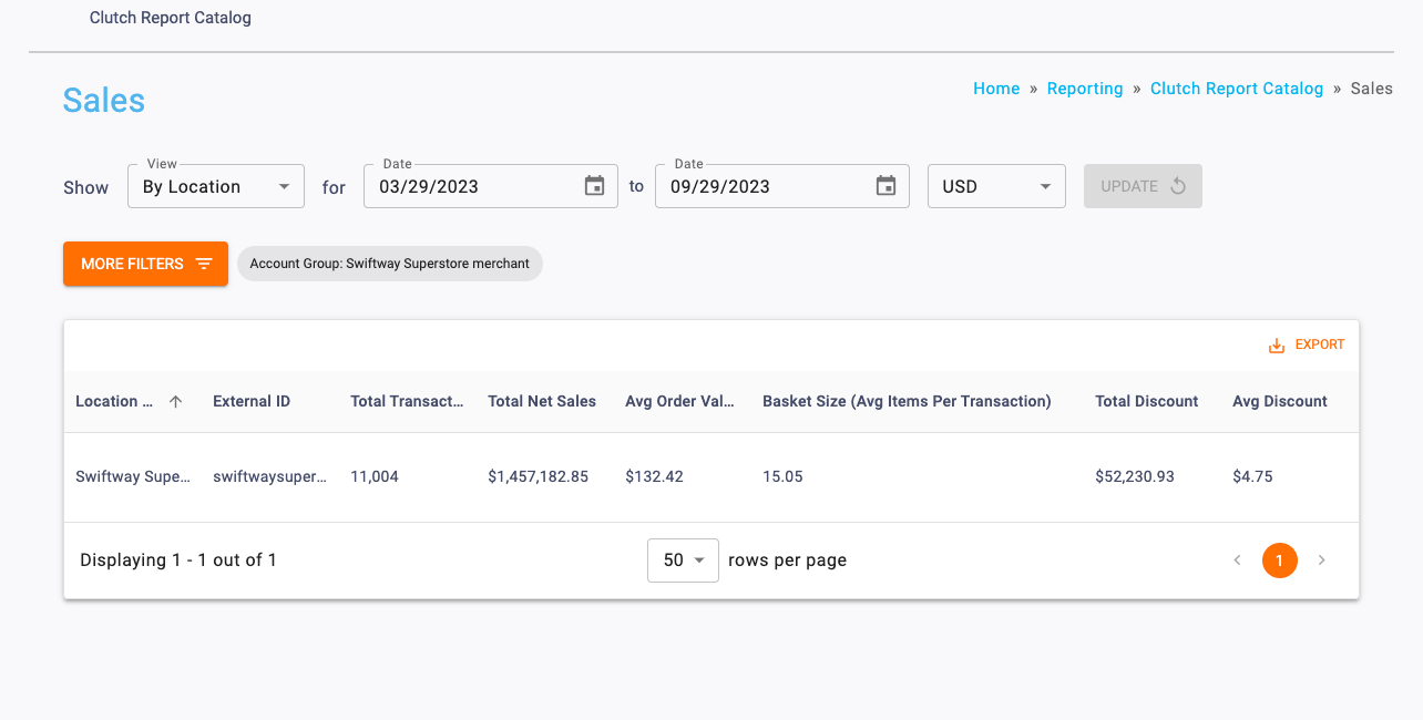
Note: The table results can be downloaded as a CSV using the Export button. Table columns can be temporarily rearranged by holding click on the column header and dragging to the left or right. These changes are passed through to the Export and reset when the page is reloaded.
The Labels dropdown is used to toggle whether data labels will appear on the graph or not. Selecting with labels will display a more detailed graph containing labels. Selecting without labels will display a cleaner graph.
Note that this feature is disabled for the Timeline version of this graph.
You’ll be able to determine the timespan of the chart. It can toggle between Timeline, Month, or Day of Week. Read below to learn more about these timespan options.
Timeline
This displays a trend over time chart that plots metrics by day. The bar on the bottom of the chart can be used to zoom in or out to different date ranges on the timeline. All data for the selected date range will be displayed. If more than a year is chosen in the Date Range picker, the Timeline option will be disabled and the graph will default to the Month view.
Month
This displays a trend over time chart that summarizes metrics by month.

Day of Week
This displays a stacked column chart that breaks metrics out by the day of the week and time of day.

Note that metrics are assigned to the time of day groupings according to the local time of the transaction. For example, if you have a location in New York and a location in Los Angeles with transactions that occur at 8am local time for each location, both would be assigned to the 6:00-11:59am group.
This view will break out the sales metrics by Loyalty Status, which means you’ll be able to see information on:
- Loyalty Customers (transactions that are tied to an enrolled card)
- Identified Customers (transactions that are tied to a card that has activated, but not enrolled)
- Anonymous Customers (transactions that are not tied to a card).
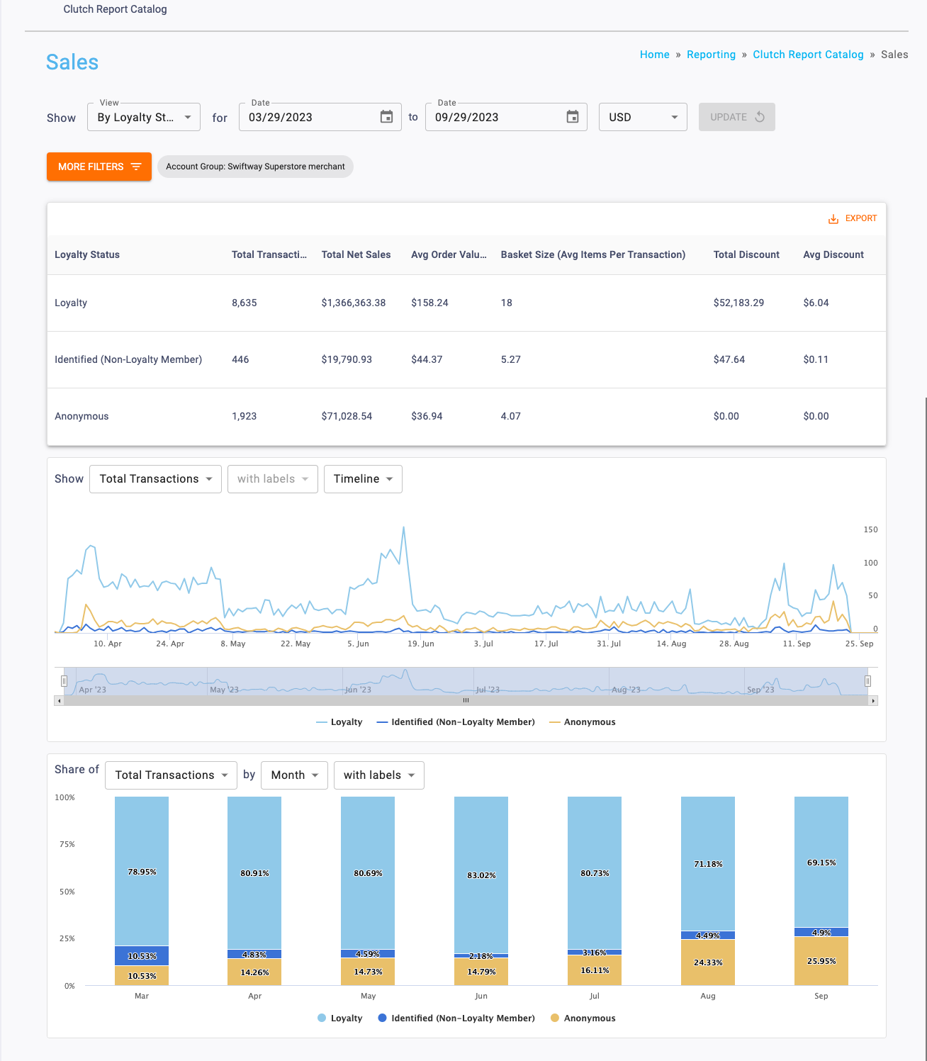
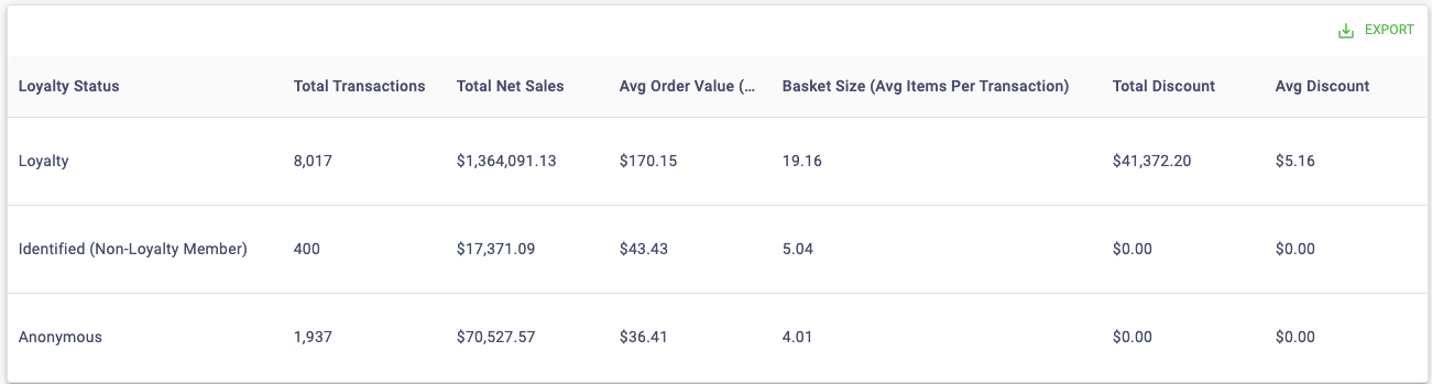
Report Table
In this view, you’ll see a table with the following columns:
- Loyalty Status
- Total Transactions
- Total Net Sales
- Avg Order Value (AOV)
- Basket Size (Avg Items Per Transaction)
- Total Discount
- Avg Discount
Note: The table results can be downloaded as a CSV using the Export button. Table columns can be temporarily rearranged by holding a click on the column header and dragging to the left or right. These changes are passed through to the Export and reset when the page is reloaded.
Trend Over Time Chart
The line graph shows various campaign metrics over time. You’ll be able to alter the time period as well as show the information with or without labels.
The metrics that can be viewed are:
- Total Transactions
- Total Net Sales
- Avg Order Value (AOV)
- Basket Size (Average Items per Transaction)
- Total Discount
- Avg Discount
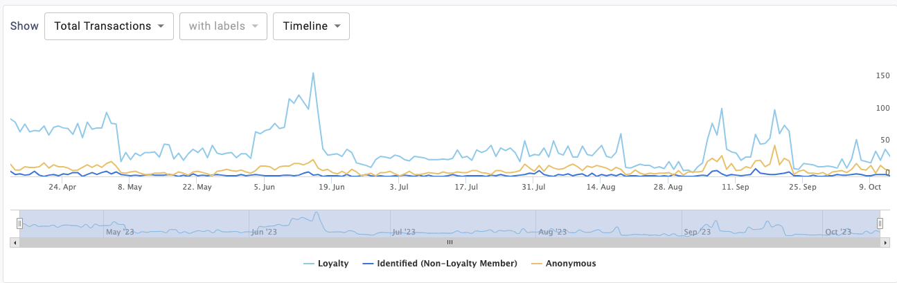
The Labels dropdown is used to toggle whether data labels will appear on the graph or not. Selecting with labels will display a more detailed graph containing labels. Selecting without labels will display a cleaner graph.

Note that this feature is disabled for the Timeline version of this graph.
You’ll be able to determine the timespan of the chart. It can toggle between Year, Month, or Quarter. Read below to learn more about these timespan options.
Year
This displays a trend over time chart that summarizes metrics by year.

Quarter
This displays a trend over time chart that summarizes metrics by quarter.

Month
This displays a trend over time chart that summarizes metrics by month.

If you wish to show or hide any of the categories in the chart legend, you can do so by clicking on the name in the key. For example, if you want to hide Anonymous customers, click on Anonymous in the legend. Click it again to allow the data to reappear.
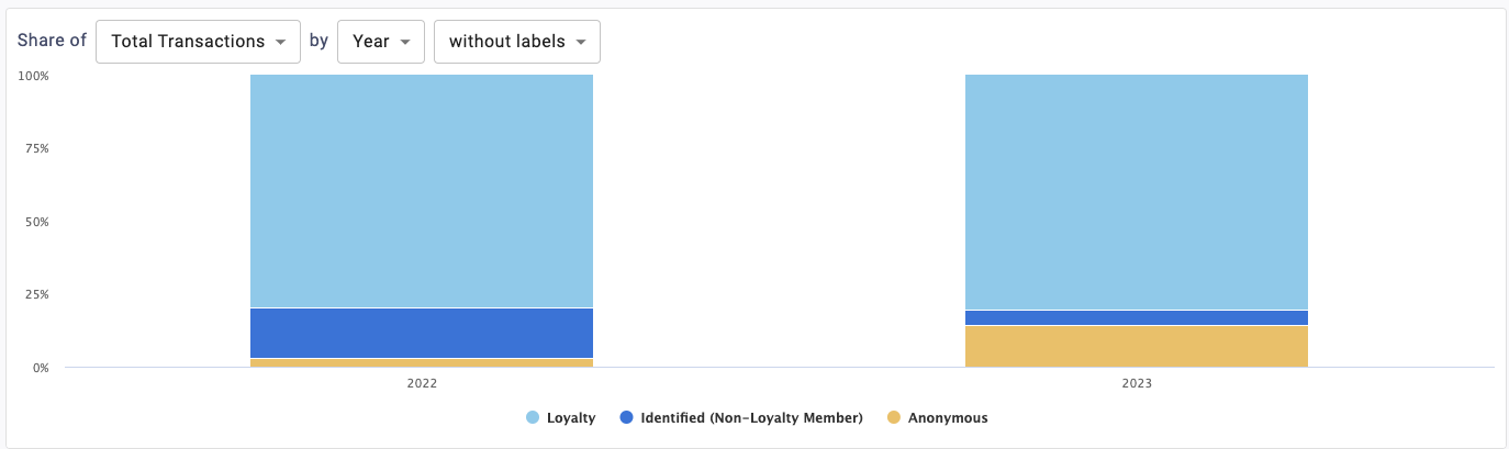
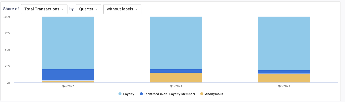
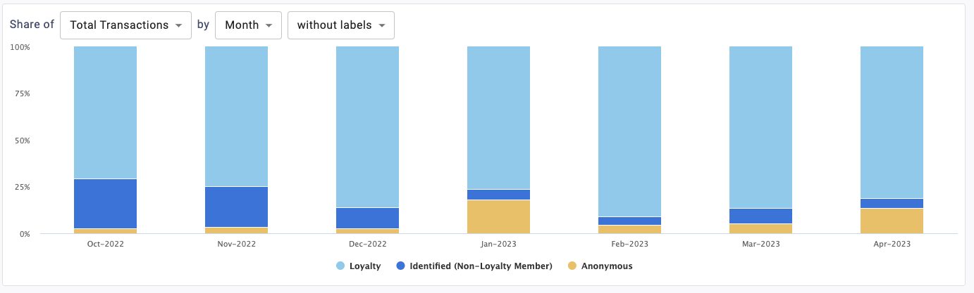
Stacked Percentage Chart
This chart plots your total sales metrics over time with percentage breakouts for each loyalty group.
You’ll be able to view the following metrics:
- Total Transactions
- Total Net Sales
- Total Discount
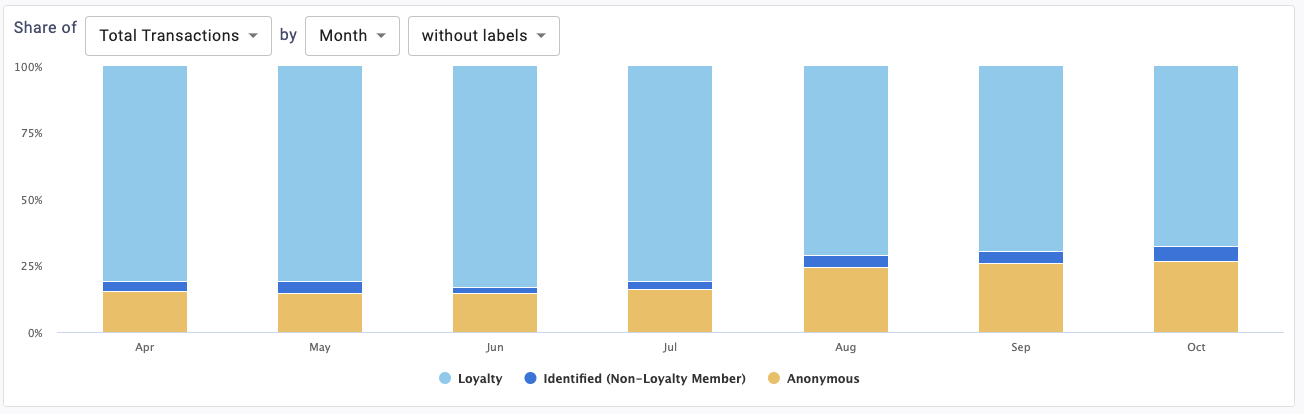
You’ll be able to determine the timespan of the chart. It can toggle between Year, Month, or Quarter. Read below to learn more about these timespan options.
Year
This displays a trend over time chart that summarizes metrics by year.
Quarter
This displays a trend over time chart that summarizes metrics by quarter.
Month
This displays a trend over time chart that summarizes metrics by month.
If you wish to show or hide any of the categories in the chart legend, you can do so by clicking on the name in the key. For example, if you want to hide Anonymous customers, click on Anonymous in the legend. Click it again to allow the data to reappear.
